Personalization has quietly moved from craft rooms and design studios into everyday life. Whether it’s decorating a travel case or adding something unique to a tote bag, people want their things to feel distinctly theirs, and they want to do it on the spot. The tools to make that happen, though, have largely stayed the same: bulky, single-purpose machines that aren’t built for spontaneity.
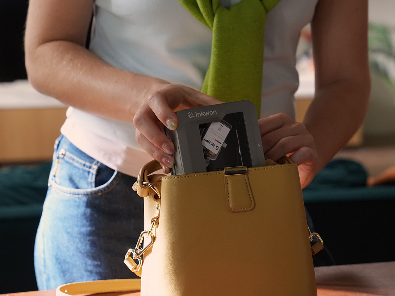
That’s the gap INKWON Tag 4-in-1 Pocket Printer is designed to fill. It’s a pocket-sized color inkjet printer that handles four creative tasks in one go: sticker printing, photo printing, temporary tattoo sticker printing, and fabric heat transfer. Rather than juggling separate devices for each, this single compact unit does all of that, and it fits right in the palm of your hand.
Designer: INKWON Printing
Click Here to Buy Now: $169 $299 (43% off). Hurry, only 169/200 left! Raised over $138,000.
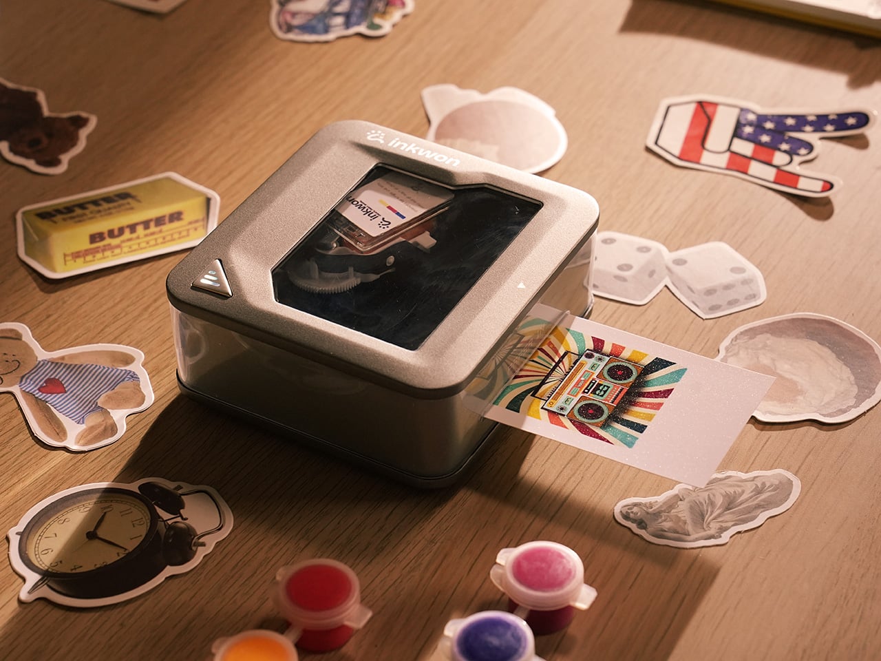
The device itself doesn’t feel like a printer in the conventional sense. It’s roughly the size of a small tin, weighs just 0.52 lbs, and its self-suction paper feed pulls media in automatically to keep things aligned. The ink cartridge snaps in magnetically, so there’s no fumbling with loading trays or making a mess every time you need to swap one out.
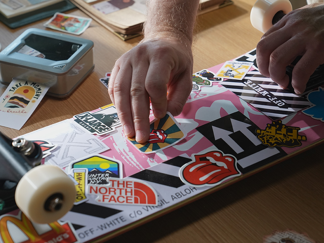
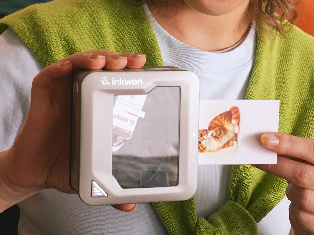
Of the four modes, sticker printing is probably the easiest to get excited about. You can print custom graphics on adhesive photo paper and stick them on practically anything: laptops, travel cases, journals, and planners. The output reaches 600 dpi, so detailed artwork holds up well even at a small format. It’s the kind of thing that takes about a minute from idea to finished sticker.
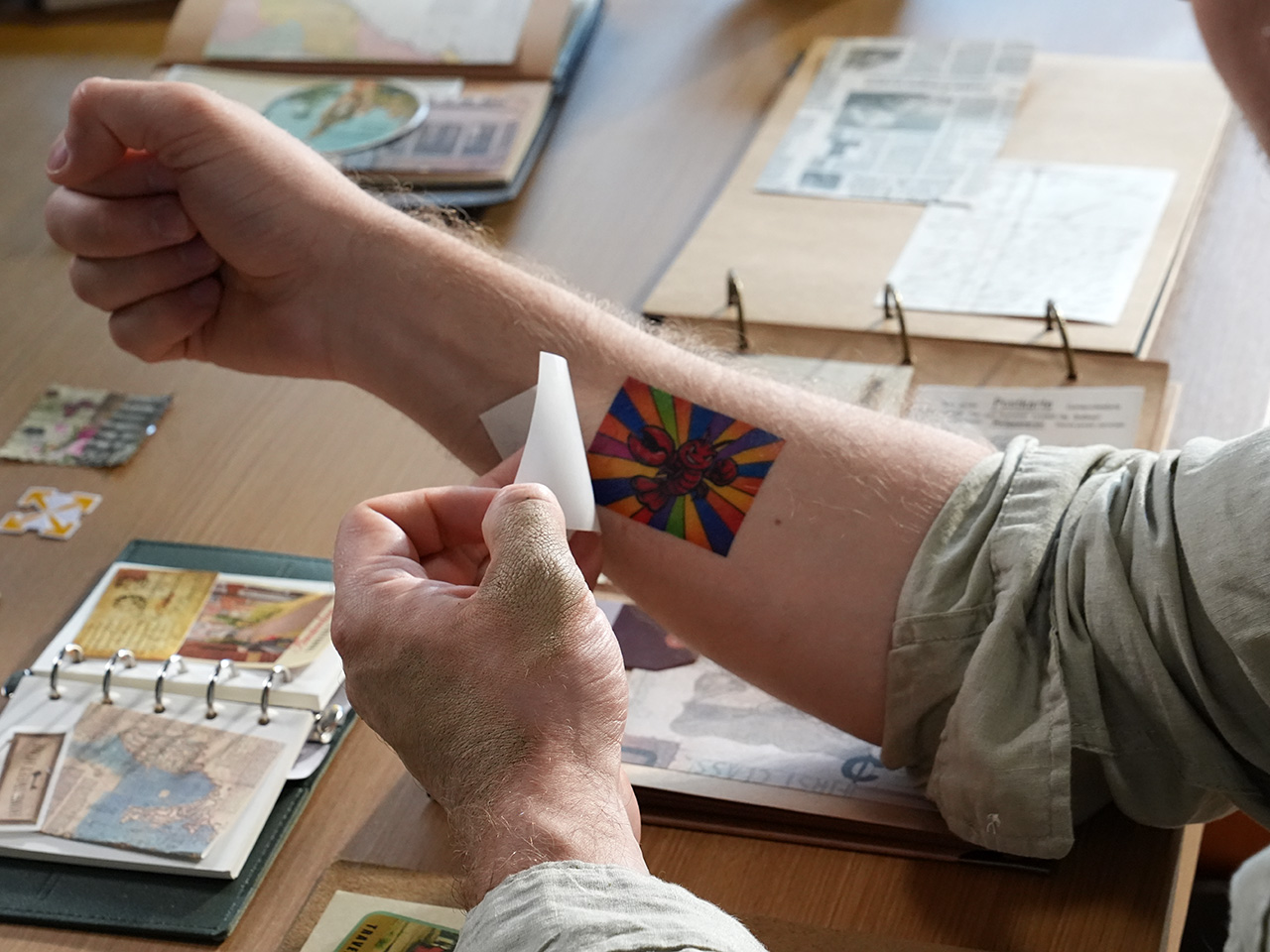
The temporary tattoo sticker mode spices things up even further. INKWON Tag prints onto tattoo sticker paper that you apply to skin just like a classic transfer tattoo, full color and all. It’s a surprisingly handy way to test a design before committing to real ink, or to add intricate graphics to a costume without needing a makeup artist anywhere near you. Plus, the ink is 100% skin-safe, even for the little ones, as proven by EN71-3 and REACH certification.
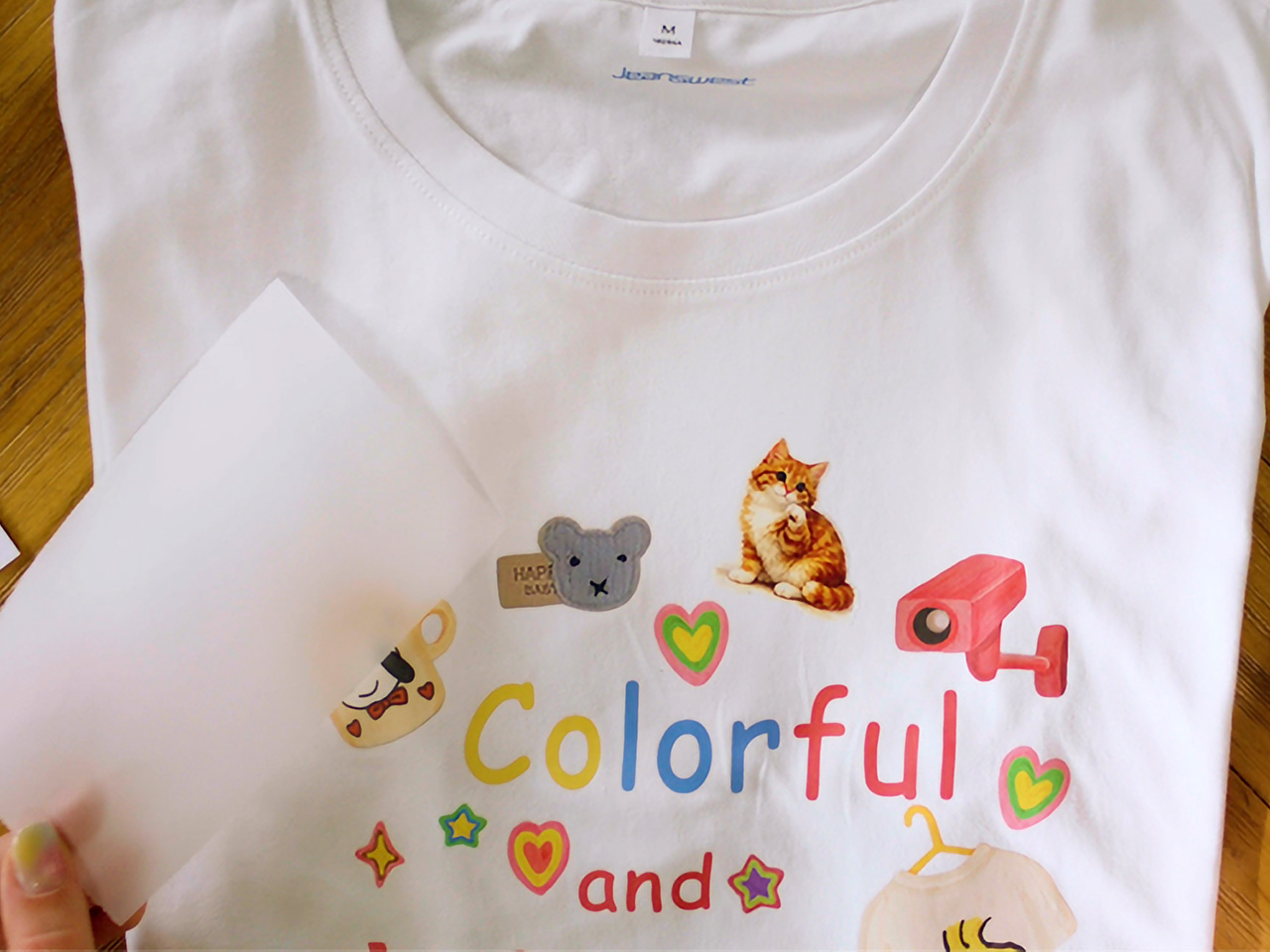
Heat transfer brings a surprising practical application you wouldn’t expect from a portable printer. INKWON Tag prints onto light-colored heat transfer paper that you then iron onto fabric, and the small form factor means you can work on precision spots that bigger machines simply can’t, like collar tips, pocket corners, or even socks. It’s genuinely handy for personalizing gifts or refreshing something plain.
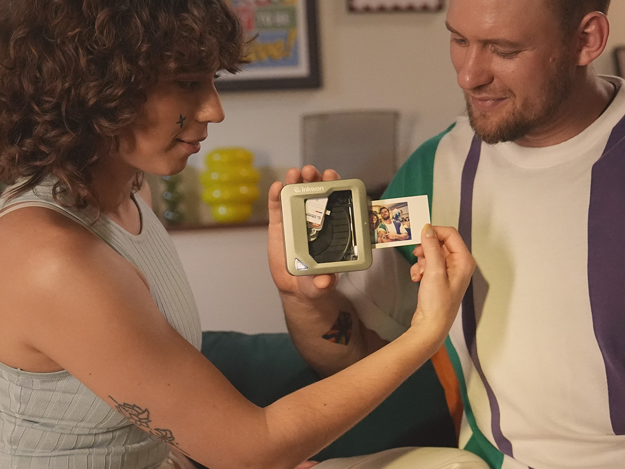
Last but definitely not least, photo printing rounds out the four modes, and it’s probably the one most people reach for first. INKWON Tag turns phone snapshots into actual prints you can hold, making them easy to tuck into travel journals, scrapbooks, or stick onto memory pages. They don’t end up buried in a camera roll. They’re physical now, and that alone makes them feel worth keeping.
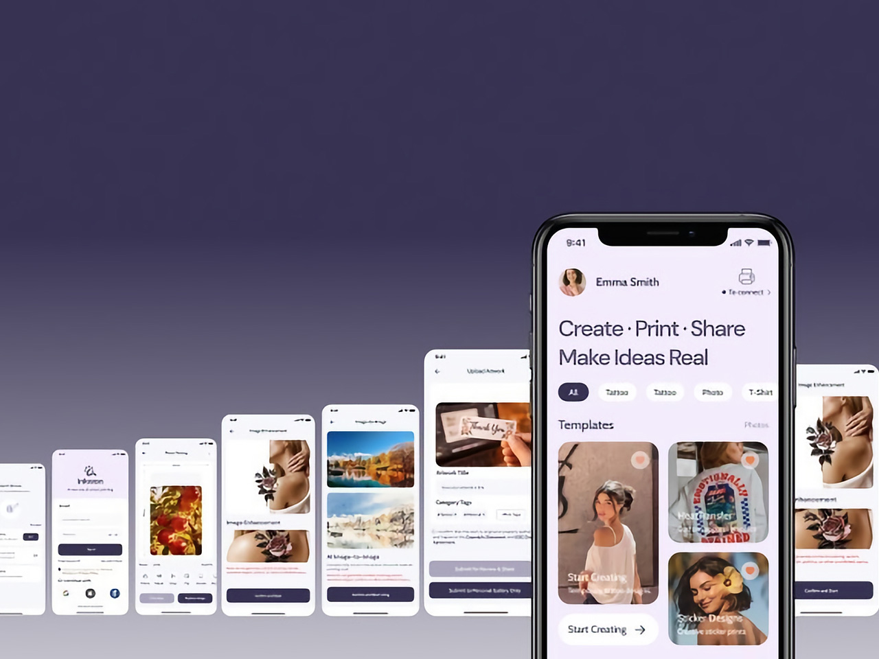
INKWON Tag connects to your phone via Bluetooth 5.4, and the companion app takes care of everything from image uploads to editing and sending the print. It works on both Android and iOS and supports 18 languages, so you’re covered regardless of where you are or what phone you carry. A full charge handles up to 60 prints, which happens to match exactly one ink cartridge.
Portable creative tools have been getting smarter for years, but most still stick to one trick and leave you hunting for everything else separately. INKWON Tag bundles stickers, temporary tattoo stickers, heat transfers, and photo prints into one device that easily fits in a jacket pocket, and it doesn’t need a desk, a software driver, or a dedicated power outlet to make any of that happen.
Click Here to Buy Now: $169 $299 (43% off). Hurry, only 169/200 left! Raised over $138,000.
The post This Pocket Printer Turns Out Temporary Tattoos, Stickers, and Photos first appeared on Yanko Design.